

For the uninitiated, Prashant Arora, MD, Rock & Storm Distilleries, provides a valuable insight into the current approach of the liquor industry towards bottling, packaging and labelling of its products. He even explains how this approach differs from that of the foreign brands selling in India.

Giving fine details of the current packaging trends, Prashant says, “In the Indian brands, labelling and packaging has become more cleaner – subtle, but not minimalistic. It is still loud, but it isn’t gaudy. There isn’t an information overload and there isn’t a gross excess of graphics. Things have become a lot more cultured and civilized.”
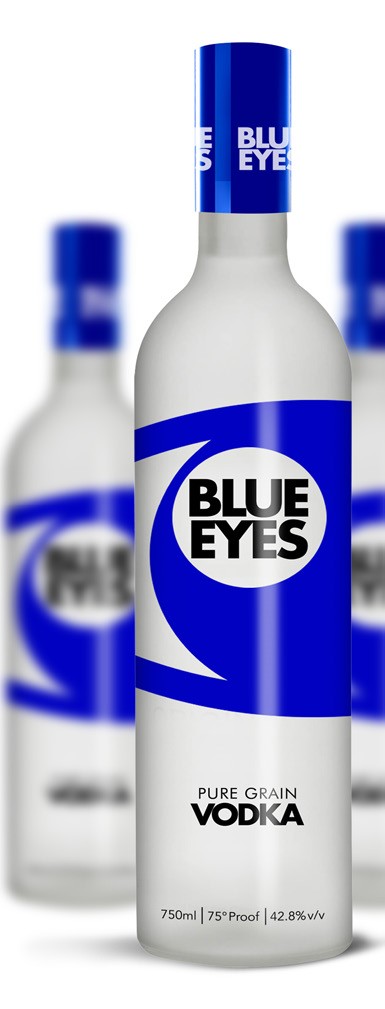
Prashant feels that the foreign liquor producers are following an approach that is just opposite to that of the Indian producers. “The foreign brands have gone from minimal to something more eye catching. It isn’t overtly attention seeking, but it is noticeable, memorable and hence easy to recall and identify,” he says.
Regarding changes in liquor bottles, Arundeep Singla, who is also MD, Rock and Storm Distilleries, says, “Bottling more or less has remained the same for quite some time. However, unnecessarily large bottles are being avoided for substitutes that are more functional and sensible. In bottling, it’s mostly economics and cross-industry standards.”

Delving on the reasons behind the packaging-related changes, Arundeep says, “In labelling and packaging, it’s all about what looks good and just like fashion, trends change. The Indian brands realized throwing everything didn’t look good and lost product appeal along the way.”
In contrast, says Arundeep, “The foreign brands realized that they had to be more eye-catching – old and loyal markets for them are set, but entering new markets and earning an original market share needs change.”
How important is the product presentation to attract consumers? “Extremely important. If something doesn’t appeal to you by the way it looks, you will never want to take a chance with that product, no matter how good it is,” says Arundeep.
He elaborates, “The saying ‘first impression is the last impression’ holds true here. After developing a great product, the next most important thing is the overall packaging, labelling and bottling of the product. The discerning consumer will go for something that appeals to the eye and speaks about quality even before tasting the product.”

When asked about the consumer fatigue about the old packaging leading to development of new packaging, Arundeep says, “The answer is yes and no.” He explains by drawing a distinction between established brands and new brands, “It is very important for new brands like our products to constantly innovate. We realize that finding perfection requires a certain metamorphosis of the self. With every innovation, a new market opens.”
However, in the case of old brands, he says, “They can sit where they are. If they tweak the way their product is presented, they can risk losing a consumer base. That’s why established brands release limited edition packaging, bottles, etc. that run parallel to their original product in the market at a premium. This is a great way to see how the consumer reacts to a visual change and it also becomes an additional source of revenue as special and limited edition products often get sold out.”

Talking about the packaging of their products, Arundeep says, “Rock & Storm firmly believes in constant evolution and strives to deliver the best product it can. Finding the fine balance between eye-catching but not too loud is the key. This balance is brought to our product by our design team and our innovation team after thorough market research and deliberation.”
Regarding the purpose of the changes in their product packaging, Arundeep says, “The main objective of any change is to give the existing consumers a product and therefore a brand that is a testament of constant innovation and strives for excellence. At the same time, we want to explore a wider, newer market.”

He is “extremely happy and proud of what each of our changes has achieved. It has been observed that the steps we take are accepted warmly by existing and even undecided consumers.”Interestingly, just an announcement of bringing a festive pack for Dennis Special Whisky, the flagship brand of Rock & Storm, brought good dividends in terms of sales. Sharing this interesting development, Arundeep reveals, “Just before releasing the product in the market by announcing it through back channels, our sales in the NCR region touched a milestone one month before the release of the pack itself. This shows how even a buzz about the visual rebranding can build excitement about the product in the market.”
When asked about new trends in caps and closures, Prashant lists four primary trends that have dominated the industry for a long time. These trends are represented by these four types of caps and closures – plastic screw closures, metal crowns, metal screw closures and corks. According to him, each type has its advantages and disadvantages – whether seen from the perspective of a consumer or a producer.
“Each type of cap or closure comes with its own functional capability and limitation. There is never a single type of beverage where all four of them will be used. It will always be limited to one or two types of closure techniques for each type of beverage,” Prashant says.
Rock & Storm “as a producer of all kinds of beverages uses all kinds of caps and closures that are modified to suit our purpose and quality control standards after rigorous testing,” he informs.
Rock & Storm outsources all its packaging needs. However, “assembly of the final product takes place in-house under very strict quality control measures with the highest standards being maintained across all verticals of the manufacturing process,” says Prashant